The Hanging Plan
In July, I was awarded my LRPS by the Royal Photographic Society. My application was the result of about 6 months worth of planning.
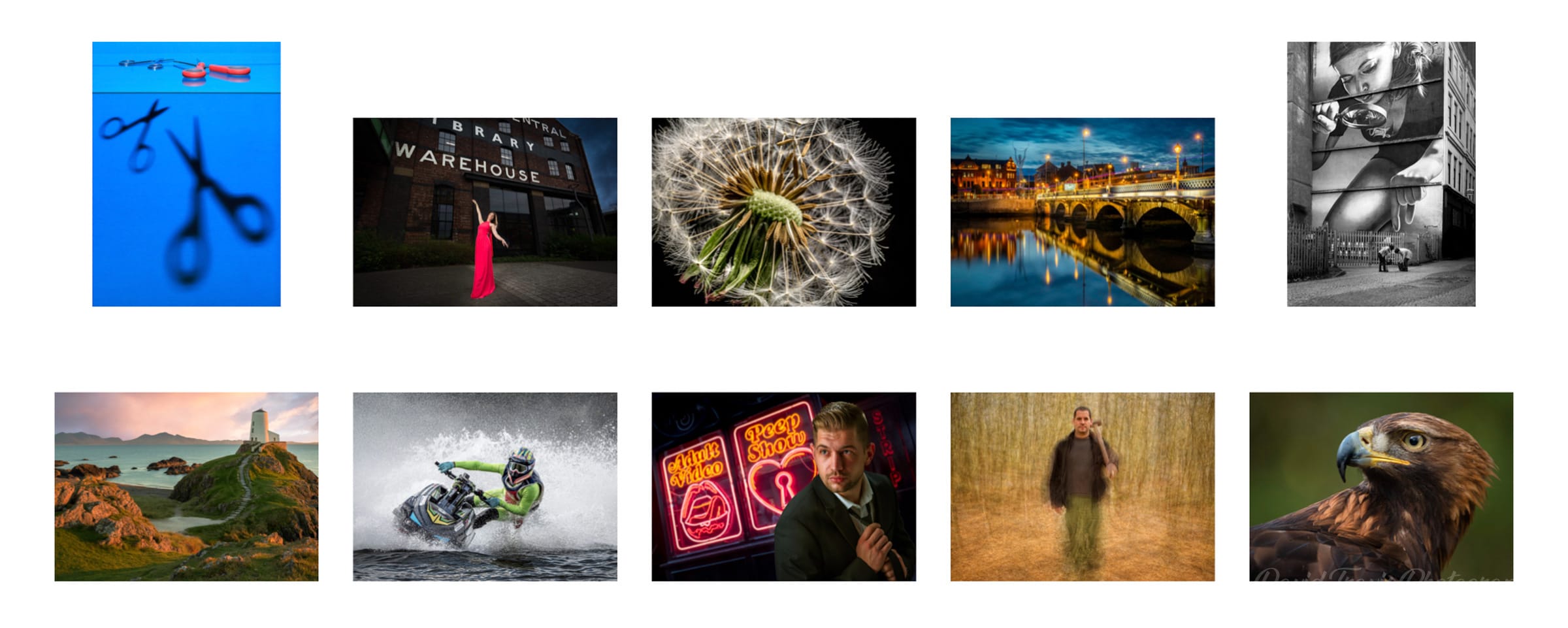
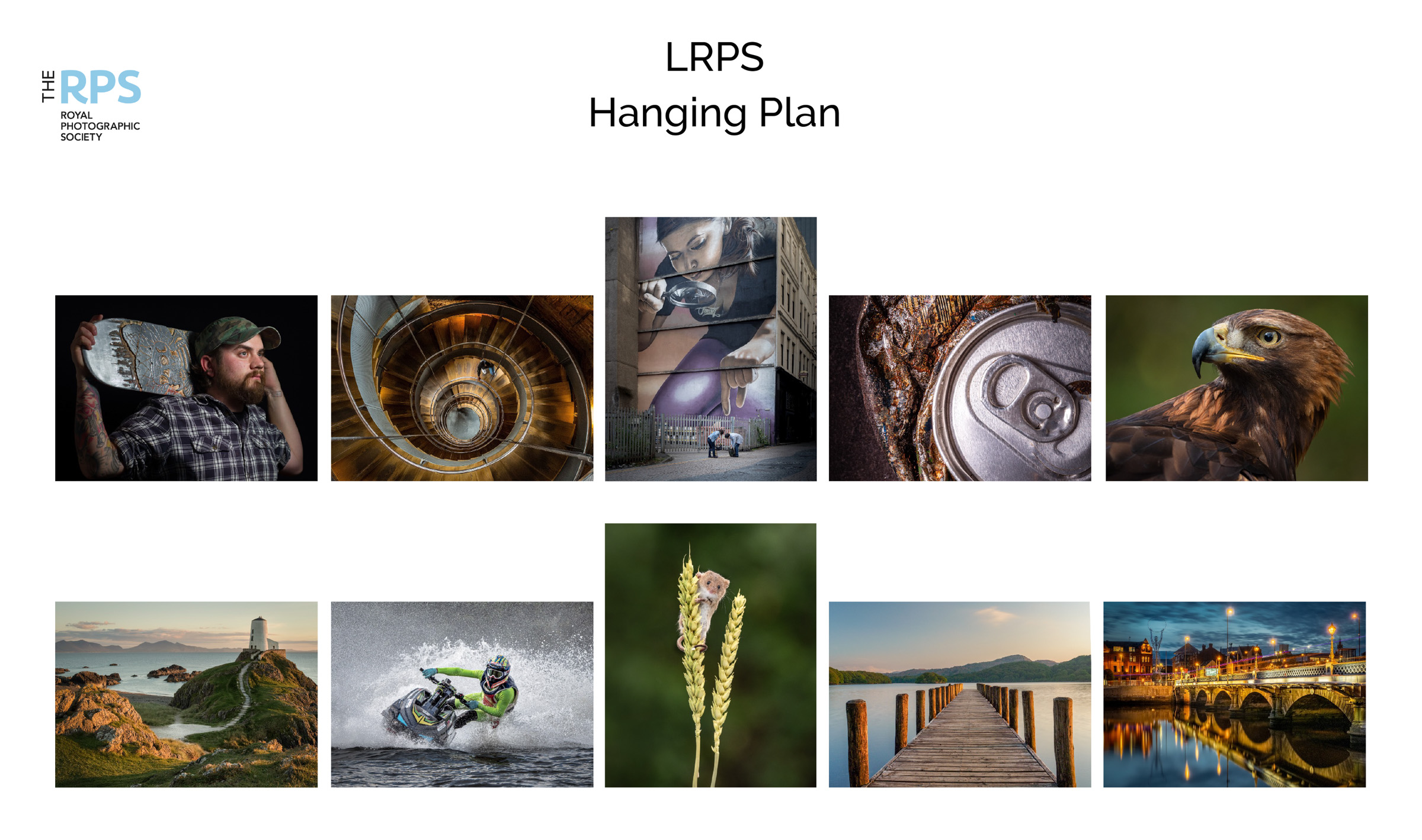
Before I explain why I chose the individual pictures in my panel, I want to show the hanging plan. For a print submission, the 10 images in your panel need to form a cohesive group. People often refer to the hanging plan as ‘the 11th image” and there are stories of panels failing, not because the images were poor but because the hanging plan wasn’t thought out.
My LRPS Hanging Plan I found it useful to think of my hanging plan in terms of pairs of images. If you think of the images as numbered 1-10 from the top left (1) to the bottom right (10), I thought of the outside images on each row as a pair (i.e. 1 & 5 and 6 & 10). I also treated the two middle images (3 & 8) as a pair. So I was looking to create horizontal and vertical symmetry. It’s also considered important to make sure the outside images lead the viewer into the panel: so for example, the panel wouldn’t work if I swapped images 1 and 5 because then the implied leading lines would pull the viewer out of the panel.
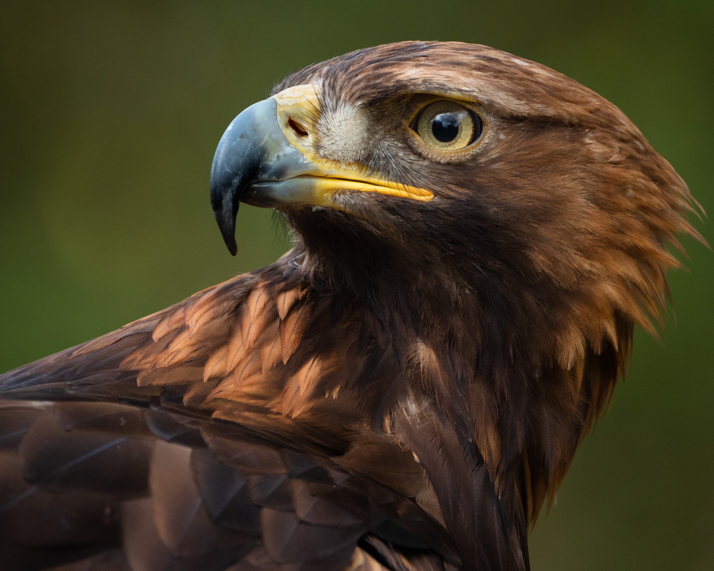
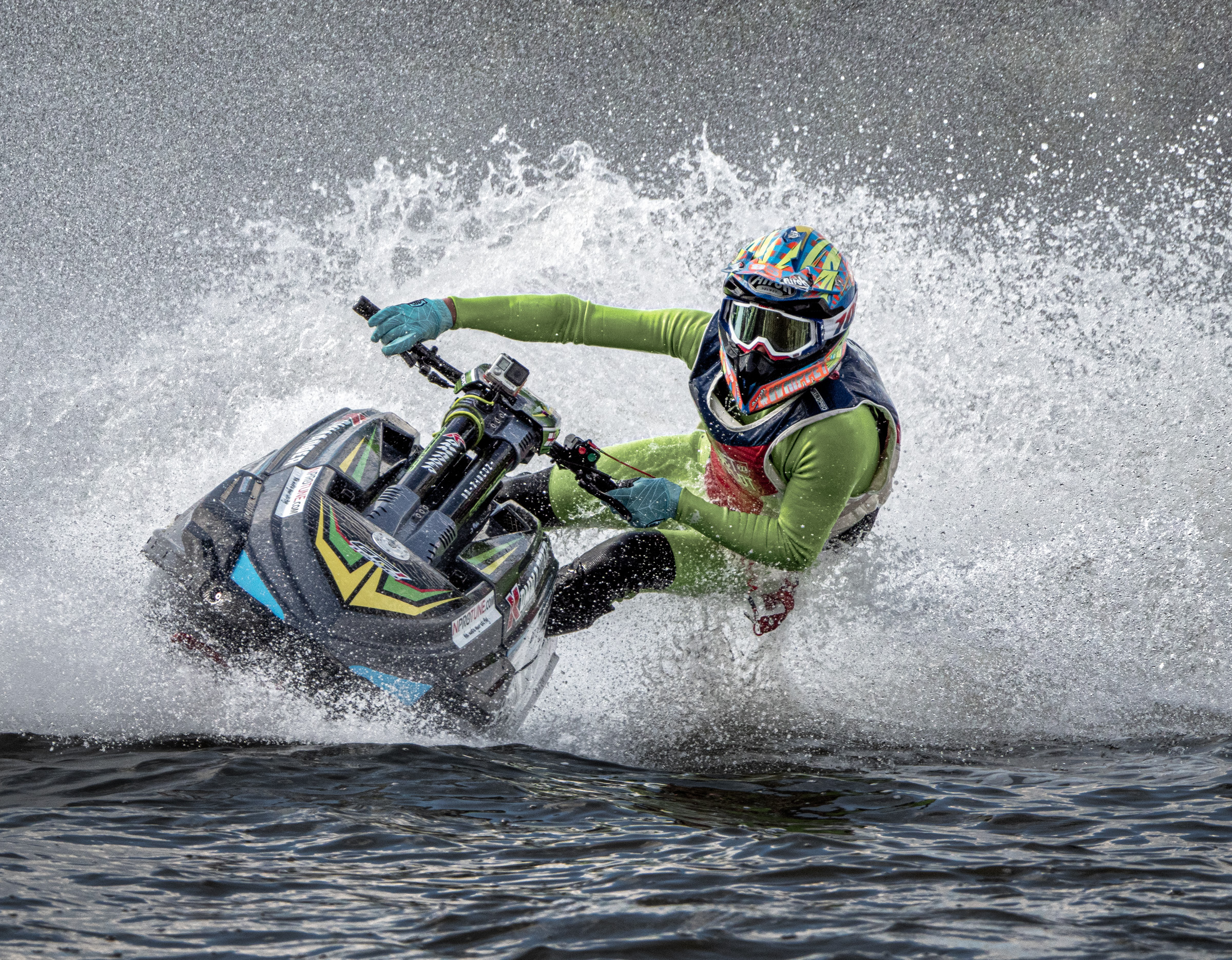
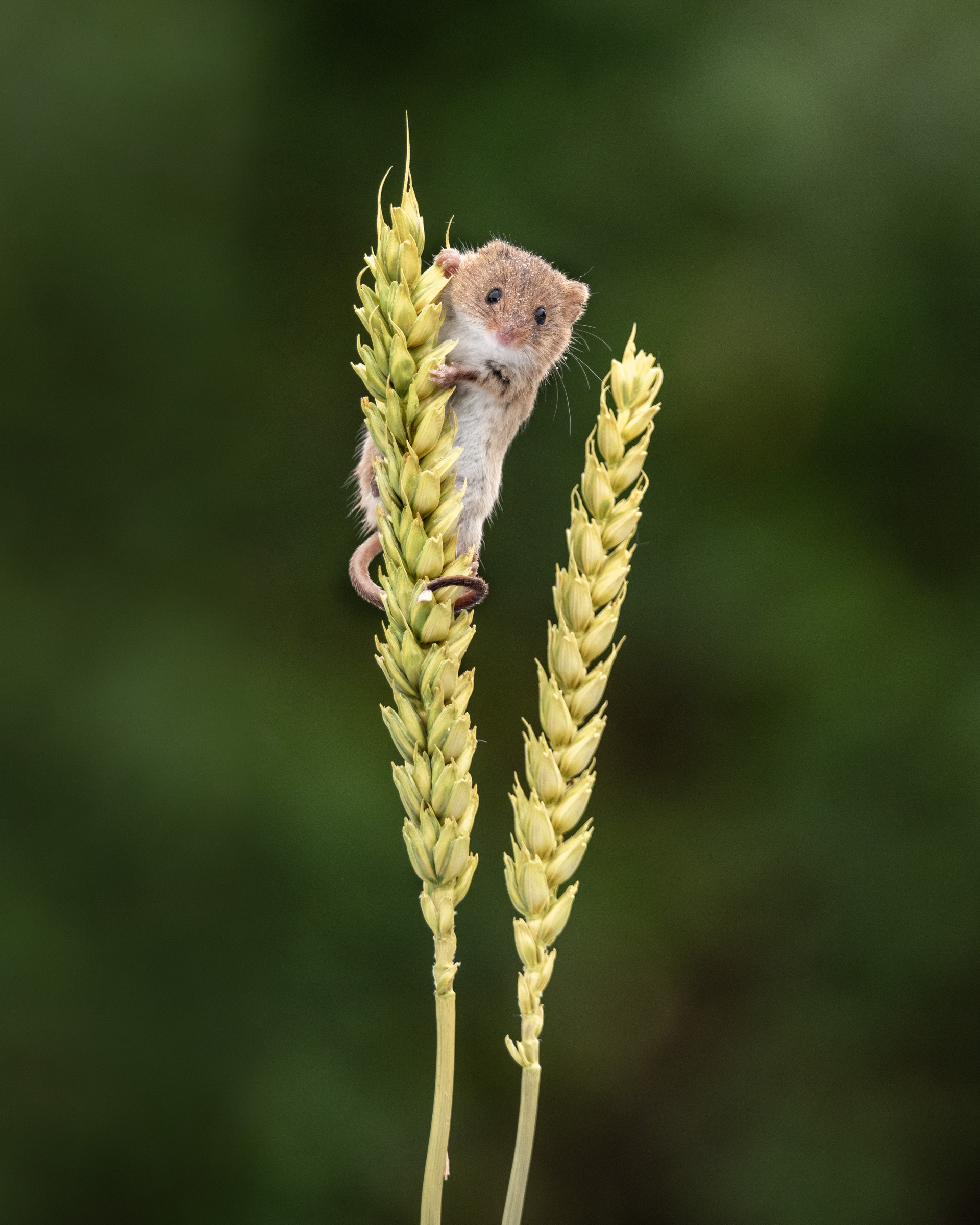
I found this the hardest part of putting my panel together. It meant that the final 10 images in my panel aren’t my best images; they’re just a permutation of the images in my archive that I think work together as a group.
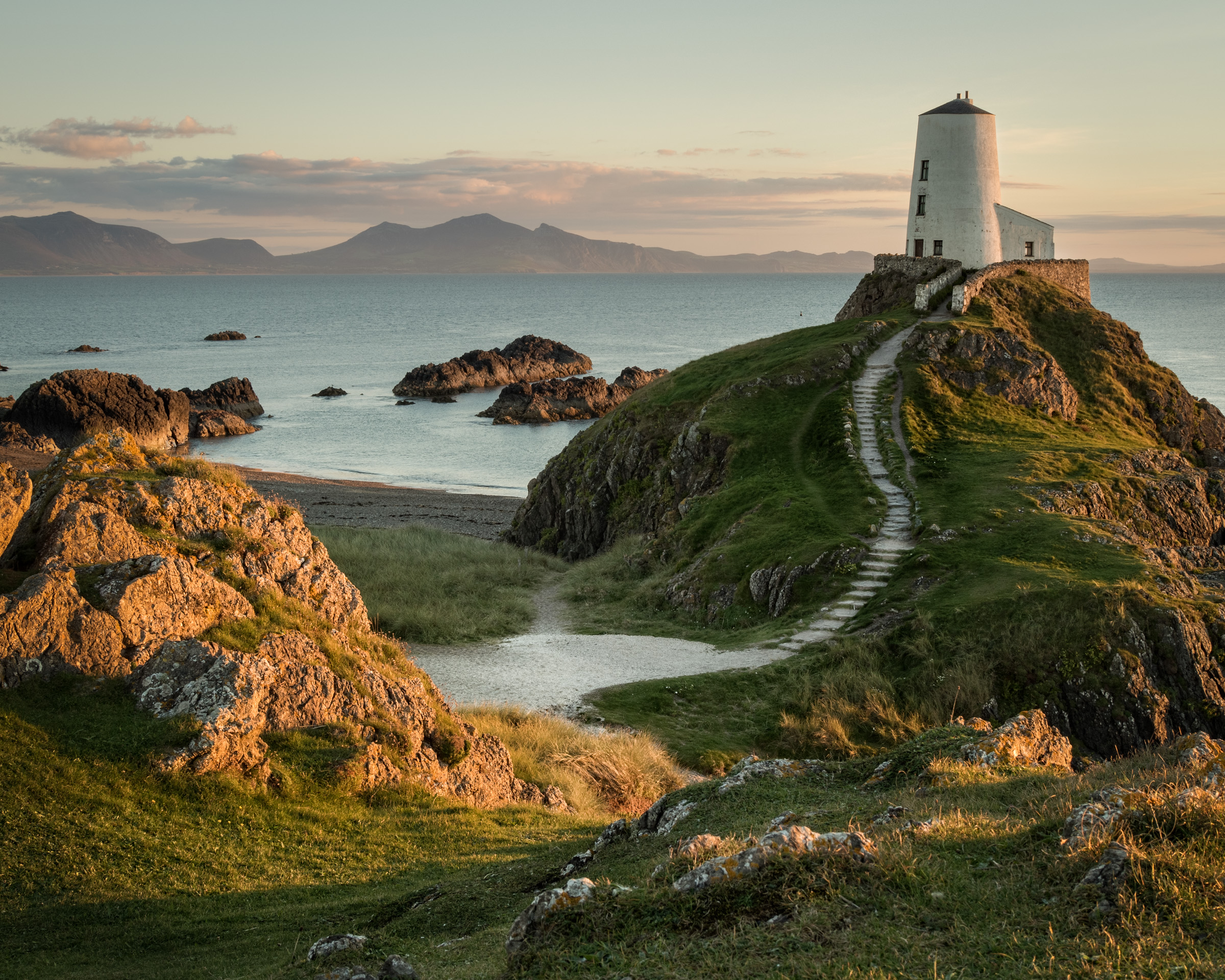
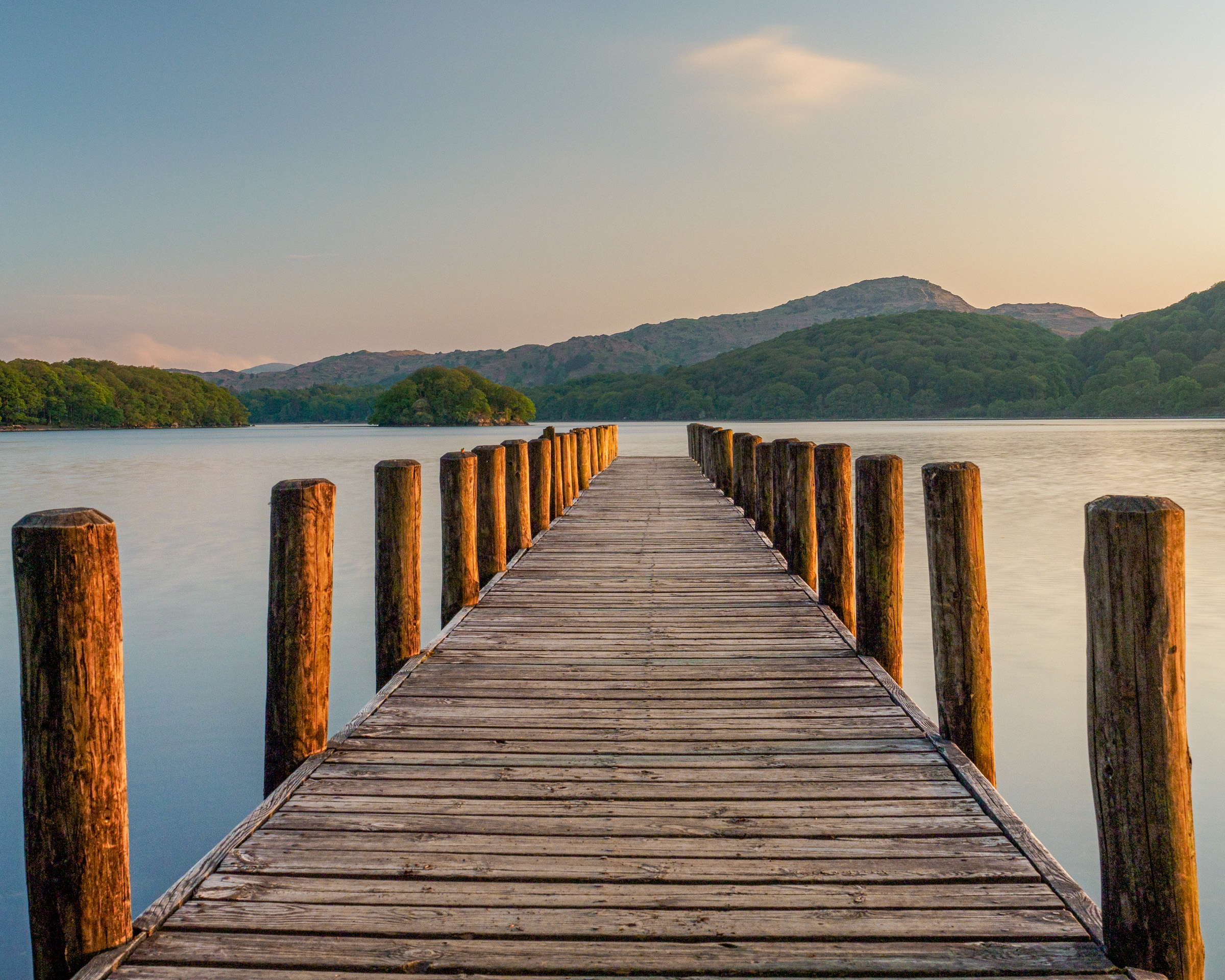
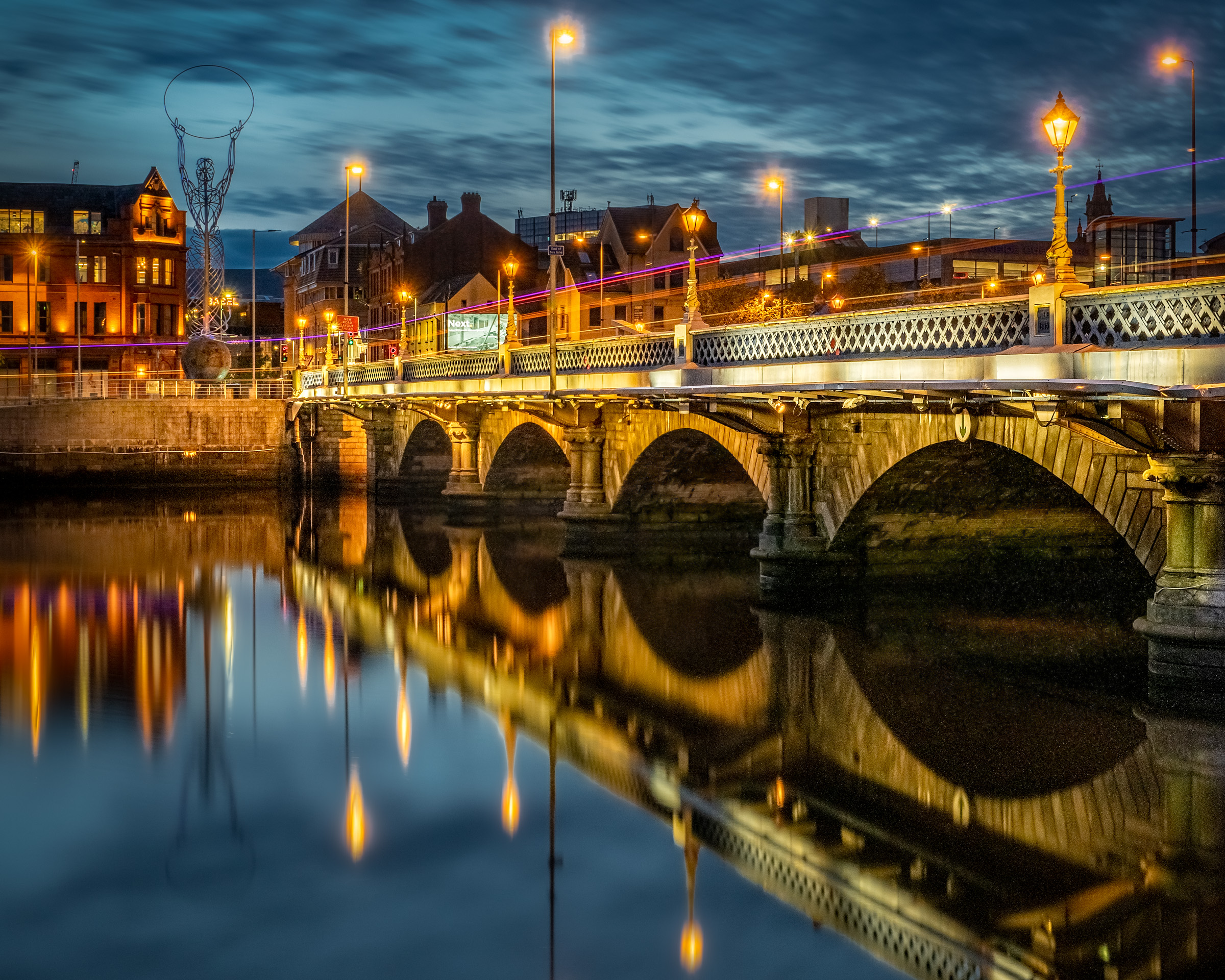
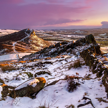
Because I wanted the hanging plan to look cohesive, it also meant I made each of the images the same aspect ratio: 10 x 8. Again, this isn’t the best aspect ratio for some of the images: I think the landscape images (in positions 6, 9 & 10) look better with a wider aspect ratio (like 6 x 4), and the graphic images (in positions 2 & 5) look better with a square crop. But this is the compromise I needed to make for the images to work as a panel.
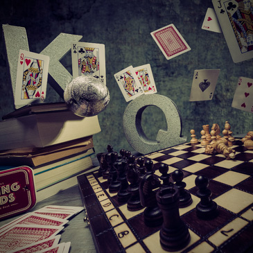
Early draft. For comparison, here’s an earlier draft of a panel which had different images. I didn’t submit this to RPS; I was just playing around with different images. Taken individually, I think these images are at least as strong as the ones in my final panel. But viewed as a panel, it looks haphazard. With the strong blue image at position 1 and the black and white image at position 5, there’s a riot of colour compared with my final panel. You'll also notice an early version of the Llandwyn Island image (in position 6). It's overprocessed here with a fake sky so I fixed that in my final submission.