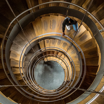
What does 'good' look like to a photography club judge?
I joined my local photography club last year.
Every few weeks, the club holds a photography competition on a particular theme (like landscapes, portraits or natural history). They invite an external judge to give his opinion on the photographs and identify the top 10%-20%. As well as identifying the top three images, the judge also hands out lesser awards like “commended”, “highly commended” and “very highly commended”.
It’s interesting to hear a judge’s opinion on your photographs. But as a psychologist, I know the weaknesses of this approach.
Photograpy judges show poor inter-rater reliability
In psychology, we have the notion of inter-rater reliability. For example, when an Olympic judge rates the performance of a gymnast, their rating should be close to the rating of another judge observing the same performance. If one judge thinks the performance is worth 8/10 and another judge thinks it’s worth 4/10, then there is poor inter-rater reliability. You improve inter-rater reliability by having clear and open criteria describing what “good” looks like and by training the judges on those criteria.
Our most recent competition was an “Open” competition, which means people can re-enter images that have done well in a previous competition. I noticed that a couple of club members had re-entered images that had previously been placed first. This is a good test case for inter-rater reliability.
Interestingly, neither of these images ended up in the top 20% (i.e. they didn’t even get commended). This illustrates poor inter-rater reliability.
Intuition is hard to talk about
In the absence of having clear criteria, judges fall back on intuition. The problem with intuition is that it's not something you can articulate. Intuitive responses are beyond our conscious introspection.
One of my favourite research studies proving this was carried out forty years ago by psychologists Richard Nisbett and Timothy Wilson. The researchers set up a table outside a store with a sign that read, "Consumer Evaluation Survey: Which is the best quality?" On the table were four pairs of ladies’ stockings, labelled A, B, C and D from left to right. Most people (40%) preferred D, and fewest people (12%) preferred A.
In fact, all the pairs of stockings were identical. The reason most people preferred D was simply a position effect: the researchers knew that people show a marked preference for items on the right side of a display (another finding from psychology). But when the researchers asked people why they preferred the stockings that they chose, people identified an attribute of their preferred pair, such as its superior knit, sheerness or elasticity. The researchers even asked people if they may have been influenced by the order of the items, but with just one exception (a psychology student who had just learnt about order effects) nobody thought this had affected their choice. Instead, people made up plausible reasons for their choice.
When judges look at your picture they either like it or dislike it: it has impact. Impact means that it draws you in, it tells a story, it shows you something you haven't seen before (or it shows you the thing in a different, interesting way). I've written about impact elsewhere.
But when they reject or accept a photograph, judges tend not to talk about impact. Instead, if they don't like a photograph, they critique it on technical grounds. In psychology, this is known as "confabulation": basically, making things up.
A checklist for judging the technical aspects of a photograph
Although the following checklist won't give your photograph impact, it will make it harder for the judge to reject it on purely technical grounds. It’s my way of listing what “good” looks like to a photography club judge.
These seem to be the technical criteria that judges use:
- Are there any blown highlights? If so, it's likely to get automatically rejected. I imagine that specular highlights that go to pure white are OK, but I don't know for sure.
- Is there detail in the shadows? It's OK to have some blacks, but if there are large swathes of shadow (like a black jumper in a portrait) then there needs to be detail in it.
- Are there any "weeds" or is there any clutter in the image that distract from the subject? If so, can you clone them out or remove them with a different crop?
- Look at the edges of the picture. Are there any highlights (like clouds) near the edges of the frame? Is there anything bright or distracting (like a path) that leads the viewer out of the picture? If so crop it out or clone in something less distracting.
- Keep looking at the edges of the picture. Ensure that nothing is part in or part out. Either get it all in or get it all out.
- At the same time, you should crop intentionally. Don’t have large swathes of white space that add nothing to the image.
- Is there adequate contrast between the subject and the background?
- Is the image sharp in the right places with appropriate depth of field?
- Is the choice of viewpoint correct with no overlaps (like a branch growing out of the subject's head)?
- If the image has a leading line, does it lead to something interesting or does it just fizzle out?
- Is the horizon level?
- Does the picture give an impression of depth? For example, if the subject is posed in front of a brick wall, the wall should recede into the background rather than be shot straight on.
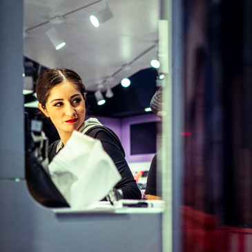
- Studio portraits against a seamless background tend not to do well, no matter how well they are lit. Judges seem to prefer environmental portraits that tell a story (especially composites).
- Studio still life images of objects tend not to do well: judges argue that the the creator of the original object was the artist, not the photographer. A good flower still life is OK. Perhaps a more constructed still life might work too.
- Architecture shots need to be more than a straightforward picture of a building. Otherwise, judges argue that "it's someone else's artwork”.
- Is the main subject of the photograph on one of the thirds? Judges tend not to like a subject in the centre of a frame.
- If it's a black and white print, is there a subtle colour cast? ("I can see magenta in there," as one judge said).
- Are there any "Halos” around the subject because of excess use of clarity or sharpening?
As I've said, you can fix all of these things in a photograph, but a judge may still not like it. This is because (contrary to what they may think) their judgement is based on impact, not on technical issues at all. But if you use this checklist, at least you'll make the judge suffer a little as they struggle to articulate their reasons for rejecting your image.
Note added
After I wrote this article, Kevin Burton pointed me to this special issue of the PAGB's newsletter on judging (PDF file). It's very thorough and well worth a read.